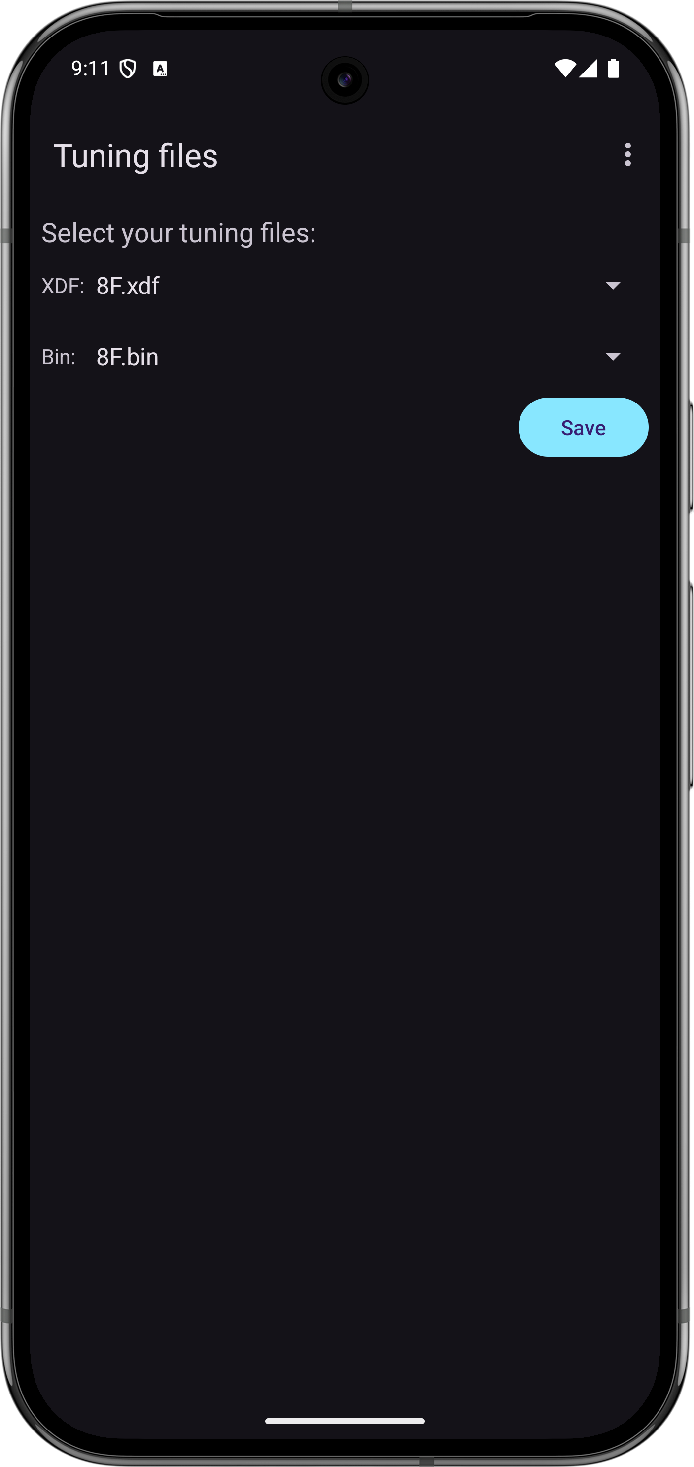
Data logging records ECM parameters over time so you can analyze engine behavior after the fact. ALDLdroid records all parameters defined in your ADX file plus optional device sensor data (GPS, accelerometer) into CSV and XDL log files for easy export and analysis.
Recording Logs
While connected to your ECM, use the Start data logging menu to begin logging data. All active parameters from the data stream will be recorded at the polling rate of your connection. Tap Stop to end the recording. Log files are saved in CSV and XDL format to the ALDLdroid/datalogs/ directory on your device.
Log File Format
Logs are saved as both CSV and XDL files. CSV files can be opened in any spreadsheet application (Excel, Google Sheets, LibreOffice Calc) or imported into analysis tools like MegaLogViewer or custom scripts. XDL files can be opened in TunerPro — make sure you are using the exact same ADX file in TunerPro as you had loaded in ALDLdroid when the log was recorded, otherwise the data columns will not align correctly.
Managing Data Logs
ALDLdroid provides a built-in data log management screen where you can browse, open, rename, delete, and share your recorded log files. All logs stored in the ALDLdroid/datalogs/ directory are listed here with their recording date, duration, and file size.
Available Actions
- Open — Load a log file into one of the built-in log viewers (time-series, scatter graph, or maps) for analysis.
- Rename — Give your log a descriptive name (e.g., "WOT pull highway 3rd gear" or "Idle warm 85F") so you can find it later.
- Delete — Remove log files you no longer need to free up storage space.
- Share / Export — Share log files via email, cloud storage, or any other sharing method available on your Android device. This is useful for sending logs to a tuner or posting them on forums for analysis.
Tip: Keep Your Logs Organized
After a tuning session, take a moment to rename your logs with meaningful names while you still remember what each run was. This makes it much easier to compare logs later, especially when you have dozens or hundreds of recordings.
Built-in Log Viewers
ALDLdroid includes three integrated log viewers so you can analyze data without leaving the app. Each viewer is designed for a different type of analysis. You can switch between viewers from the log viewer screen.
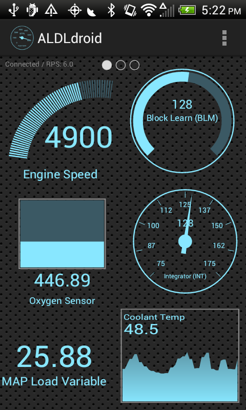
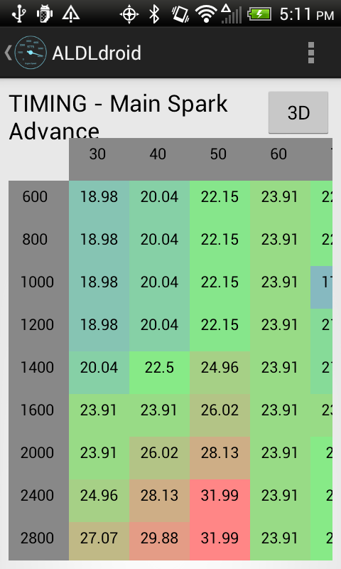
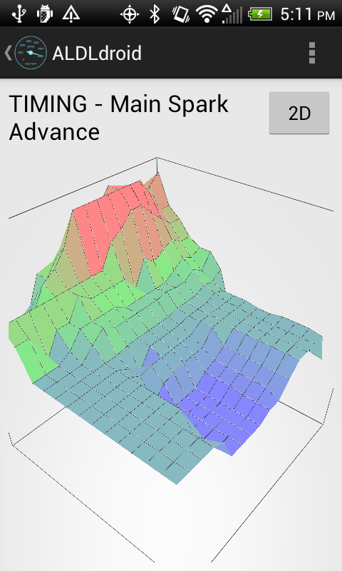
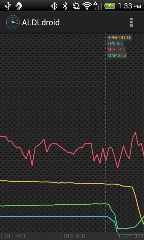
Time-series log viewer with RPM, TPS, AFR, and MAP traces overlaid
Time-Series Viewer
The Time-Series Viewer is the primary log analysis tool. It displays parameters as colored line traces plotted against time on the X axis. This is the standard way to review a data log.
Key Features
- Multi-trace overlay — Select multiple columns (parameters) from your log to display simultaneously. Each parameter gets its own color-coded trace, making it easy to see correlations (e.g., RPM rising as TPS increases).
- Cursor / scrubbing — Tap or drag along the timeline to move a cursor that shows the exact values of all displayed parameters at that point in time. This is invaluable for pinpointing the exact moment something happened.
- Zoom and pan — Pinch to zoom into a specific time window for closer analysis, or pan left and right to navigate through the log.
- Column selection — Choose which parameters to display from the full list of logged columns. You can toggle traces on and off to reduce visual clutter.
Typical Usage
Load a data log, select the parameters you want to examine (e.g., RPM, TPS, spark advance, O2 voltage, BLM, integrator), and scrub through the timeline. Look for anomalies like sudden lean spikes in the O2 trace, unexpected timing retard, or sensor values that don't track together the way they should. The overlay format makes it easy to see cause-and-effect relationships between parameters.
Tip: Merge with GPS
The time-series viewer can be merged with the GPS map viewer, letting you tap a point on the map and see exactly what the engine was doing at that location, or scrub through the time-series and watch your position update on the map.
Scatter Graph Log Viewer
The Scatter Plot Viewer lets you visualize the relationship between any three parameters from your data log by mapping them to the X axis, Y axis, and color (Z axis). Instead of plotting against time, this viewer shows how two variables relate to each other across your entire log, with a third variable represented by dot color.
How It Works
- X axis — Select a parameter for the horizontal axis (e.g., RPM).
- Y axis — Select a parameter for the vertical axis (e.g., MAP sensor reading in kPa).
- Z axis (color) — Select a third parameter to be represented by the color of each dot (e.g., spark advance, fuel command, or O2 voltage).
Each sample from your data log appears as a single colored dot on the plot. Clusters of dots show where the engine spent the most time, and the color gradient reveals how the Z parameter behaved in those operating regions.
Practical Examples
| X Axis | Y Axis | Z Axis (Color) | What It Reveals |
|---|
| RPM | MAP | Spark Advance | Shows timing across the operating range. Red zones may indicate knock retard areas. |
| RPM | MAP | Commanded Fuel (BPW/PW) | Visualizes how your fuel map is being utilized. Identifies rich or lean zones. |
| RPM | TPS | O2 Voltage | Shows air-fuel ratio behavior by throttle position and engine speed. |
| RPM | MAP | BLM / Integrator | Reveals where the ECM is making the most long-term or short-term fuel corrections. |
| Vehicle Speed | RPM | TPS | Visualizes gear changes and shift points under varying throttle inputs. |
Why Scatter Plots Matter for Tuning
A scatter plot of RPM vs. MAP colored by BLM effectively shows you which cells of your VE or fuel table need adjustment. If you see a cluster of dots at 3000 RPM / 60 kPa that are all colored to indicate a BLM of 145 (rich correction), you know that area of your fuel map is too lean and needs more fuel added.
Maps Log Viewer
The GPS & Map Viewer plots your vehicle's driven path on a map using the GPS data recorded by your Android device during the logging session. The path is drawn as a colored line, where the color represents a selected parameter value at each point along the route.
Key Features
- Color-coded path — The trace on the map is colored according to a parameter you choose (vehicle speed, RPM, TPS, etc.), giving you an instant visual overview of engine behavior along the route.
- Tap for details — Tap any point on the path to see the full set of ECM parameter values at that exact location and time.
- Merge with Time-Series Viewer — The map viewer can be combined with the time-series viewer in a split view. Scrubbing through the time-series chart updates your position on the map, and tapping a point on the map jumps to that moment in the time-series chart.
- Start and end markers — The beginning and end of your route are clearly marked for orientation.
Practical Uses
- Road tuning — Color the path by BLM or integrator to see where on your tuning route the ECM is making the biggest corrections, then focus your tuning efforts on those sections.
- Track analysis — Review speed and RPM through each corner and straight on a track layout. Identify where you are hitting the rev limiter, where shifts occur, and where you are losing speed.
- Diagnosing intermittent problems — If an issue only occurs on a specific hill, curve, or stretch of road, the map viewer lets you correlate physical location with ECM behavior.
GPS Accuracy
GPS logging uses your Android device's built-in GPS receiver. Accuracy depends on your device, satellite visibility, and mounting position. For best results, keep the device near a window or use an external GPS if your device has poor reception. Tunnels, parking garages, and dense urban canyons may cause gaps in the GPS trace.
Accelerometer Data
When enabled, the app logs your device's triple-axis accelerometer data alongside ECM parameters. This provides G-force measurements for lateral (cornering), longitudinal (acceleration/braking), and vertical forces. The accelerometer data appears as additional columns in your log files and can be displayed in any of the three log viewers.
- In the time-series viewer — Overlay G-force traces against engine parameters to see how acceleration events correlate with throttle inputs, RPM changes, or gear shifts.
- In the scatter plot viewer — Use G-force as an axis to identify how hard you are accelerating at different RPM and throttle positions.
- In the GPS map viewer — Color your path by G-force to visualize braking zones and cornering intensity on a track or road course.
For best results, mount your device securely in a fixed position aligned with your vehicle's axes (screen facing up, top of phone pointing toward the front of the car).